Practical Quantified Self Data Analysis, Pt. 1
Published May 7, 2024
Hello! Today I'll walk you through my data analysis pipeline for my personal time series data.
The problem with personal data is that it's more of a hobby than a rigorous industrial process — as such, the sensors give patchy, inconsistent data which is hard to align across time. Another issue is the movement of humans vs. the immobility of some sensors means individualized corrections must be made for each type of data depending on the source (air quality reported from your bedroom must be filtered by location, however your watch does not).
This is going to be a ~3 part series on what functions, broadly, are needed for a complete data analysis suite. I'm going to share my philosophy on this analysis and some code gists, but everything should be simple enough to adapt to other formats/libraries/languages. Let's begin!
Analysis
In my system, there are only two kinds of data: continuous data (heart rate, CO2, location) and event data (daily HRV, sleep session, coffee intake). They differ mainly by the frequency that the data is sampled. For me, here are the main kinds of graphs that I'm interested in producing:
-
Continuous vs. continuous (e.g. blood glucose vs. heart rate, scatterplot)
-
Continous after event (heart rate after drinking coffee, time series)
-
Continuous vs. event (average tetris score vs. previous sleep duration, scatterplot)
-
Event vs. event (daily HRV vs. sleep duration, scatterplot)
-
Event average after event (sleep quality after working out, bar chart)
These are not many, and they cover much of what is needed. Interestingly enough, these can all be constructed through the use of two functions.
Function 1: Interpolation by timestamp (Analyses 1, 4)
Most continuous sensors will not share timestamps, so you will need to align them (tossing stuff that doesn't line up perfectly) or "align them" (interpolate the denser value with a sparser one to get matching rows). Since we don't usually have a ton of data to spare, we go for interpolation. The code is simple, and just uses np.interpolate
This is preferred for continuous vs. continous, but for event vs. event much can happen on longer timescales so I think interpolation is quite lossy.
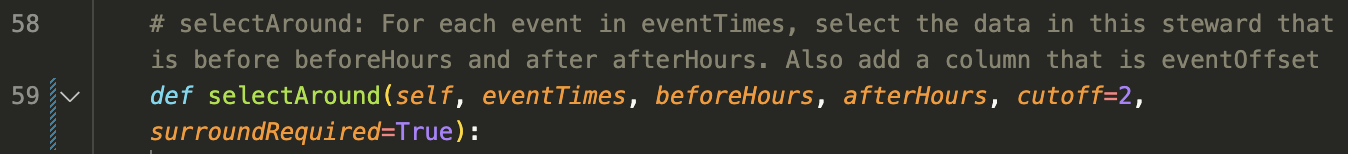
Function 2: Select around timestamp (Analyses 2, 3, 5)
Since these analyses all use event data, we will select y-variable data that lines up with the event timestamp. This function just slices out time ranges from the y-variable that are specific offsets from each x-variable event.
Once each time range is found, we toss the ranges with zero elements and then have a list of dataframes. Just for fun, I added an "eventOffset" column for each sample so we can hstack them into a single DataFrame if desired. Here's one element from the list of my heart rate dataframes.
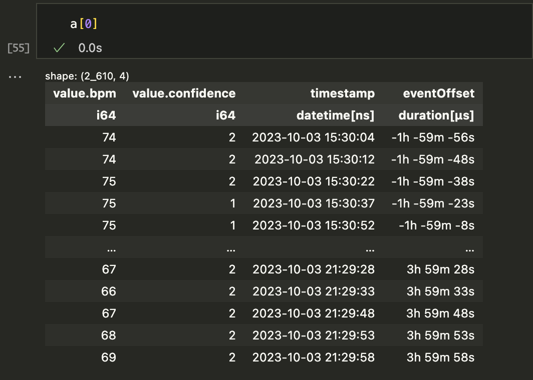
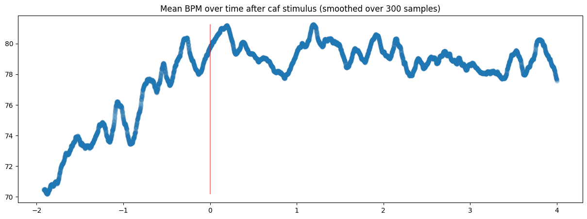
The a variable was created by running a = s1.selectAround(doseTimes, beforeHours=2, afterHours=4), selecting time ranges that included each doseTime and data from 2 hours before and 4 hours after. Once the list is made, you can just plot each time range on the same graph:
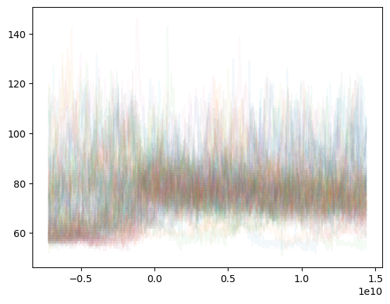
Or more cleanly, plot a smoothed mean of the same data:
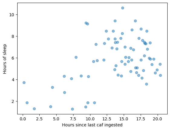
Another fantastic use case of selectAround is that I can select data that happened exclusively after or before an event time. For instance, if I wanted to see all sleep sessions happening within 6 hours of a caffeine event, I could run sleep.selectAround(doseTimes, 0, 6, cutoff=0, surroundRequired=False) and get the list of every time that happened. The inclusion of the timeOffset col also means I can scatterplot the sleep data once selected:
selectAround also offers negative lookback and lookahead, so you can do whatever you need.
Conclusion
Anyway, I think these two primitives are all you need to find any personal insights you might wish. You may also want to use filters (air quality data bool'd by location, or sleep session filtered by coffee consumption), but that will be saved for the next post.